Totara
Client: Totara Wines
Location: New Zealand
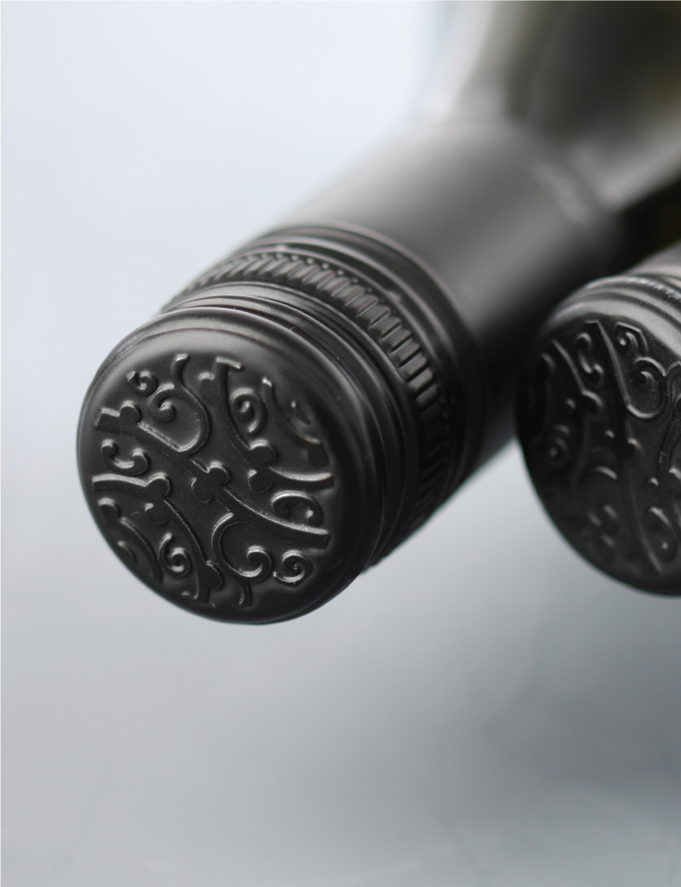
Scope: Brand design, label design, closure design, typography, illustration and print management
Team: Mike Heine, Kim Beckers, Krista Malloch, Anthea Lemmer
More >
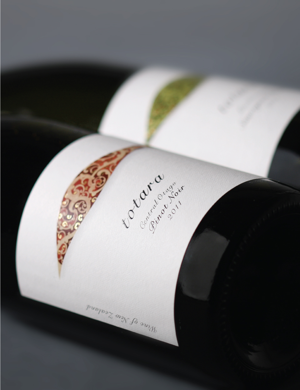
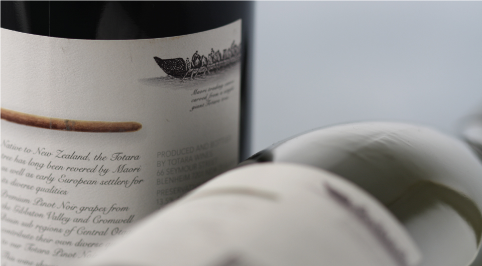
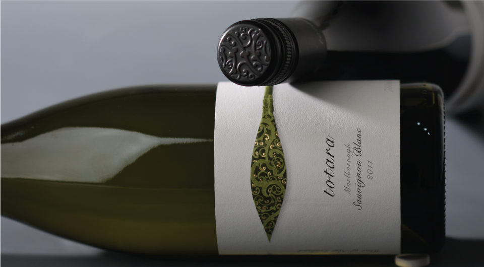
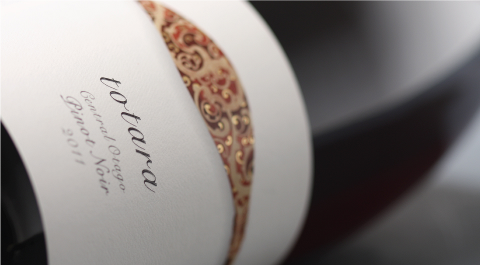
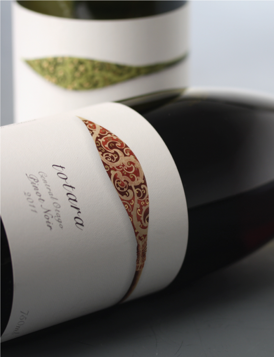
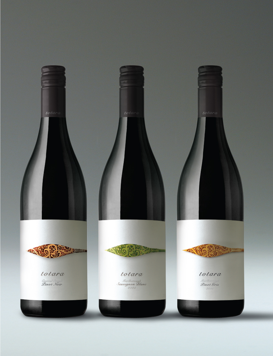
The Totara is a giant tree native to New Zealand. When HeineJones researched this tree we found that it was used by Maori warriors to build war canoes – which they propelled with beautifully decorated paddle blades – the inspiration for this understated label design.
The paddle blade illustration is used in a rich and decorative form on an otherwise austere label design. The paddles handle visual leads off to the right of the front label and draws the participant around to the back of this wide, wrap around label – where the story of the war canoe and paddle is told in a caption like way.
Printed by PanPrint in New Zealand this label uses a multitude of highly technical printing techniques and embellishments belying its apparent simplicity. HeineJones and PanPrint are proud that this label has won several awards for printing excellence.
< Less