Barossa Babe
Client: RockBare Wines
Location: South Australia
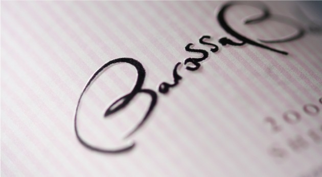
Scope: Brand creation and design, label design, closure design, typography and hand lettering, art direction and production management
Team: Mike Heine, Steve Jones, Kim Beckers, Krista Malloch
More >
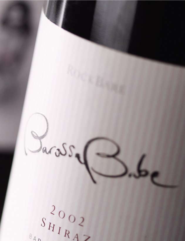
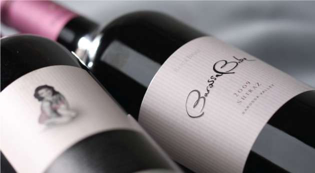
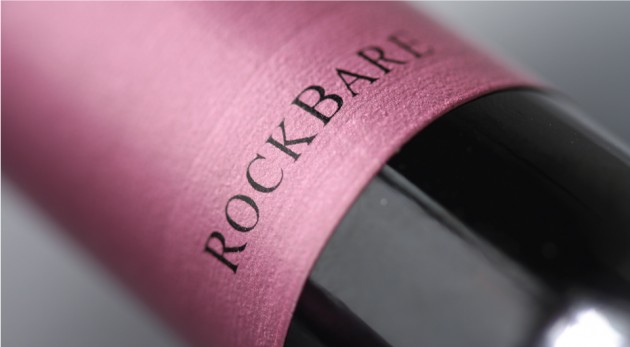
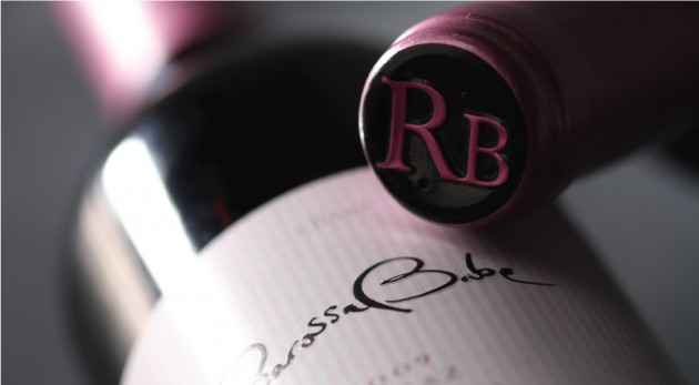
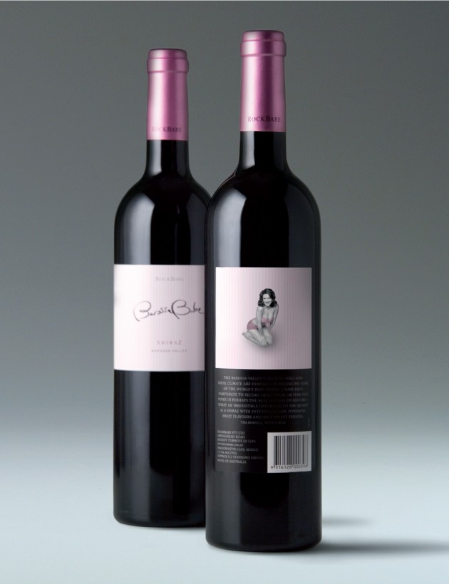
When HeineJones created the Barossa Babe package, we wanted to evoke a sense of something unusual and slightly incongruous – why does such a serious looking label and expensive product (and for that matter such a seriously good shiraz) have a pink tinge to the label and a pink closure?
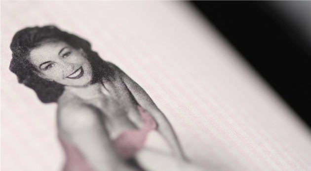
These questions which are answered when the purchaser has turned the bottle to the back label, and is engaged (and we hope delighted) by the unexpected, although perhaps predictable, image of the 'Barossa Babe'. The somewhat unusual and contradictory nature of this communication has been carefully designed to reflect the RockBare brand essence, and to lead the purchaser of this high end product to consider the other less expensive RockBare product tiers – Rockbare and Mojo.
< Less
