Social Enterprises
Client: Westgate Comminity Initiatives Group
Location: Footscray and Seddon
Scope: Brand investigation, positioning, naming, brand identity design and implementation.
Timeline: Delivered on time: Average project duration 2 weeks.
Team: Cleanable project: Steve Jones and Krista Malloch. Love Luvo project: Steve Jones, Mike Heine and Anthea Lemmer. Onsite Catering project: Steve Jones and Anthea Lemmer. Outside Branch project: Steve Jones and Anthea Lemmer.
More >
HeineJones have developed several social enterprise venture brand identities for WCIG, including Cleanable, Love Luvo, Onsite Catering and Outside Branch.
HeineJones have collaborated with client - Westgate Community Initiative Group (WCIG), in recent years to develop several branding identity programs for their stable of social enterprise ventures.
The social enterprise ventures vary in their scope of services and commercialality, however each veture shares a common ethos - to assist long term unemployed and members of the community with mental illness secure and maintain work within the social ventures.
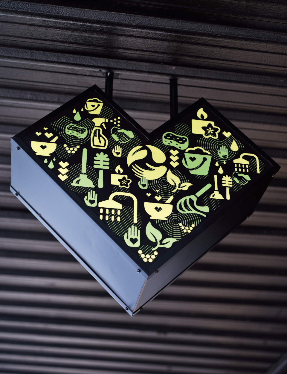
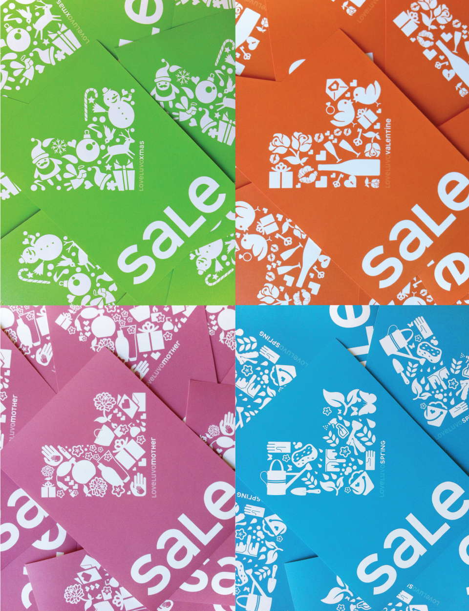
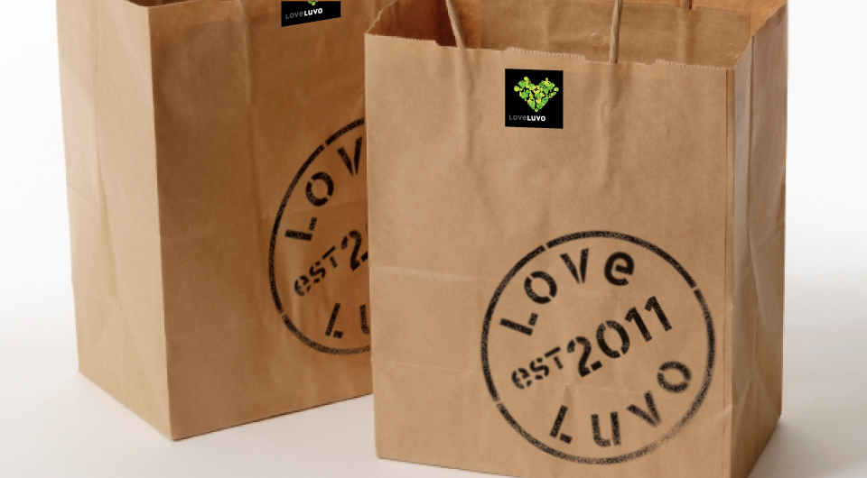
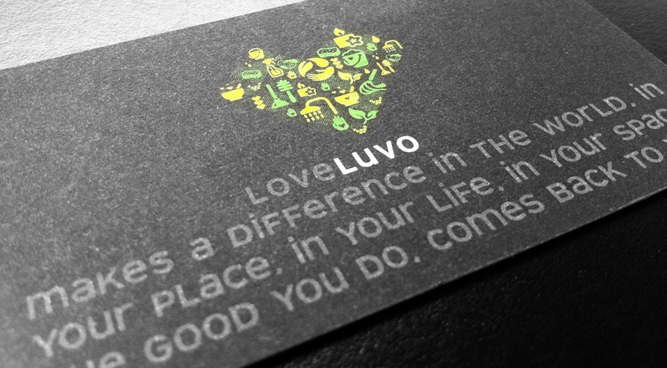
LoveLuvo is a homeware store located in Seddon. The name was developed by HeineJones and takes inspiration from latin words meaning to aid and assit. The heart shape symbol that also form an angled letter ‘L’ combines relevant iconography and an environmental colour palette, Icons such as cleaning and body products represent the range of available products in-store. The brandmark is fresh, memorable and unique.
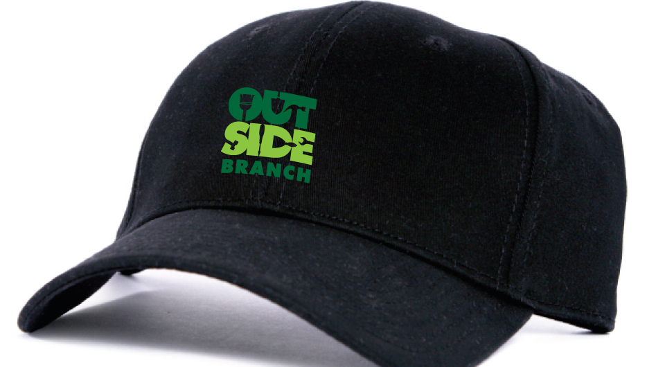
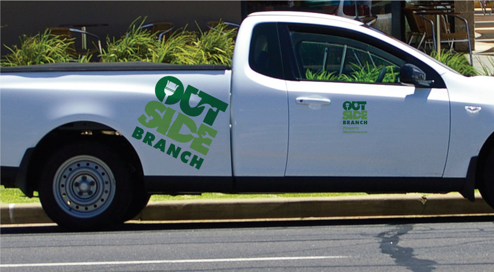
HeineJones developed the name and brand identity, ‘Outside Branch’ for WCIG’s Property Maintenance venture. The brand identity combines gardening and building tools in the letter forms to express the services offered by Outside Branch. The overall brand expression is confident and tough. The colour palette consisting of two-tone green also speaks of nature and the outdoors.
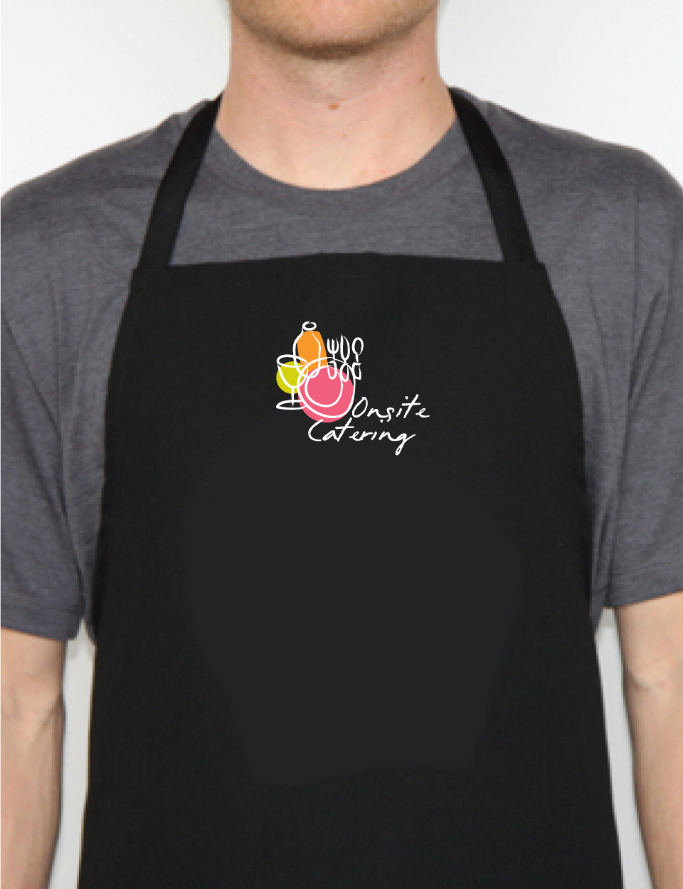
Onsite Catering supply food services in domestic and commercial environments. The new Onsite Catering logo combines catering icons and hand-drawn font expressed in a relaxed style to symbolise the friendly, social enterprise venture.
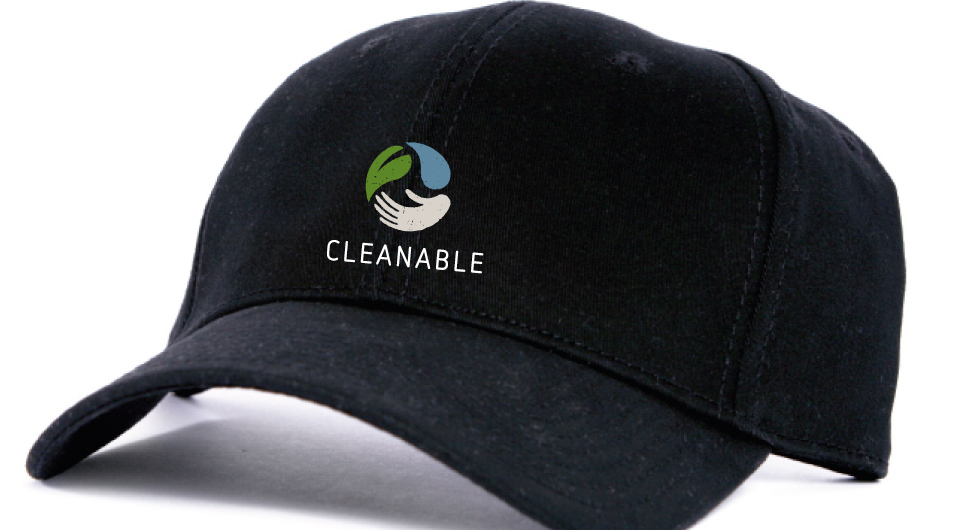
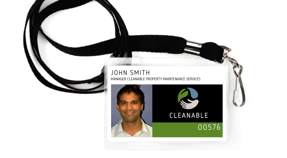
Cleanable provide domestic and commercial cleaning services to the community. The brand identity communicates the brand story. The leaf represents Cleanable’s focus on the environment and eco-friendly products. The water droplet represents the principal cleaning service and is symbolic of water conservation. The out-reached hand represents social empathy, Cleanable’s focus on helping people.
< Less