Tar & Roses
Client: Tar and Roses
Location: Victoria, Australia
Scope: Brand creation and design, label design, closure design, typography, artwork, print management, art direction, photography
Team: Mike Heine, Steve Jones, Kim Beckers, Krista Malloch
More >
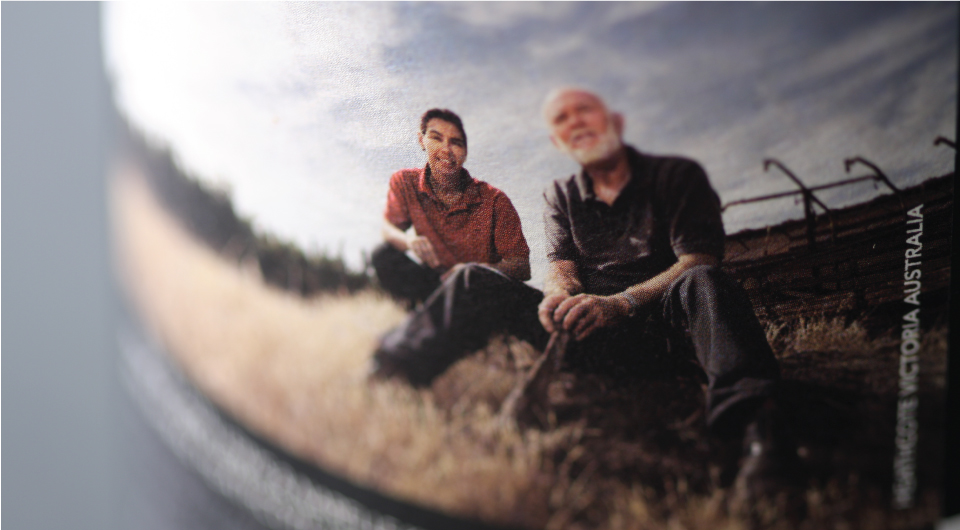
The Tar and Roses brand is a wine by Narelle King and Don Lewis, both extremely talented and experienced winemakers in their own right. Don brings a wealth of experience to the wine, and Narelle brings a quiet and youthful energy. Really, Don and Narelle need no introduction, and certainly no spin or guff to tell their story. They are quiet and modest people, who are focussed on making great wine. At the end of the day, it was the winemakers which were the inspiration for this label design – their quiet confidence, and delightful mix of experience and youth, the contrast between one and the other – formed the basis for not only the product name, but also the design approach.
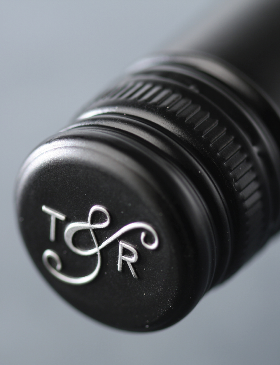
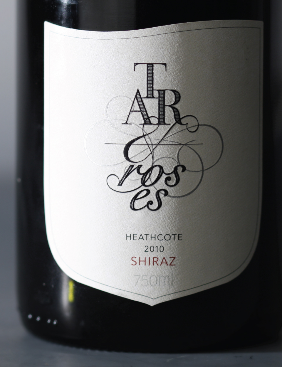
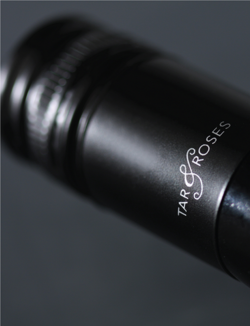
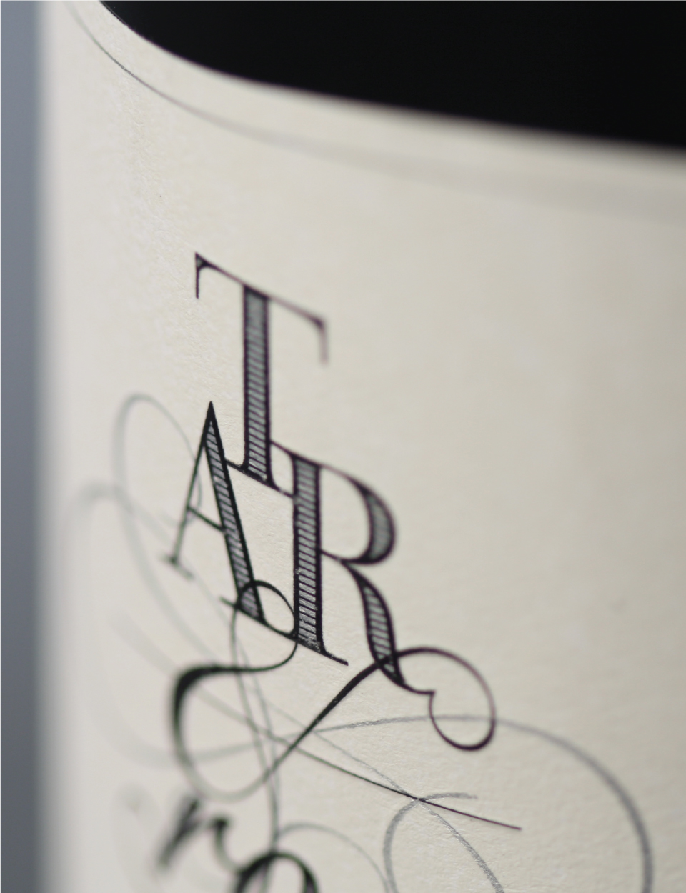
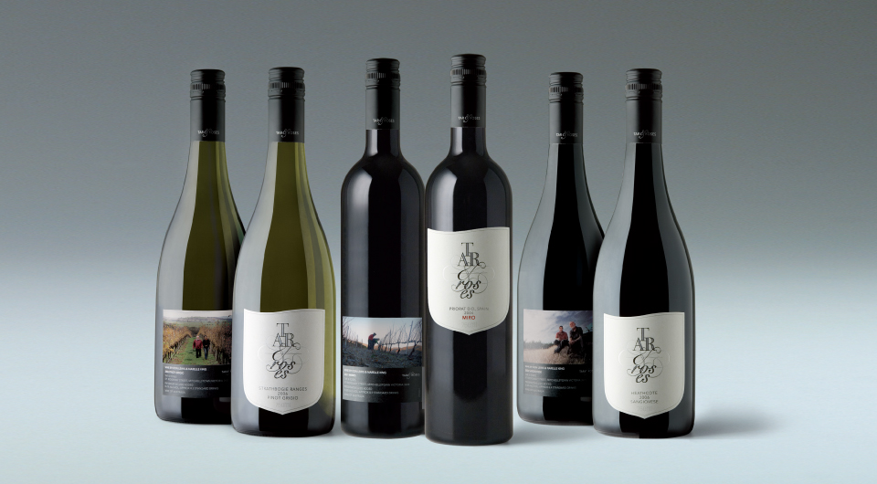
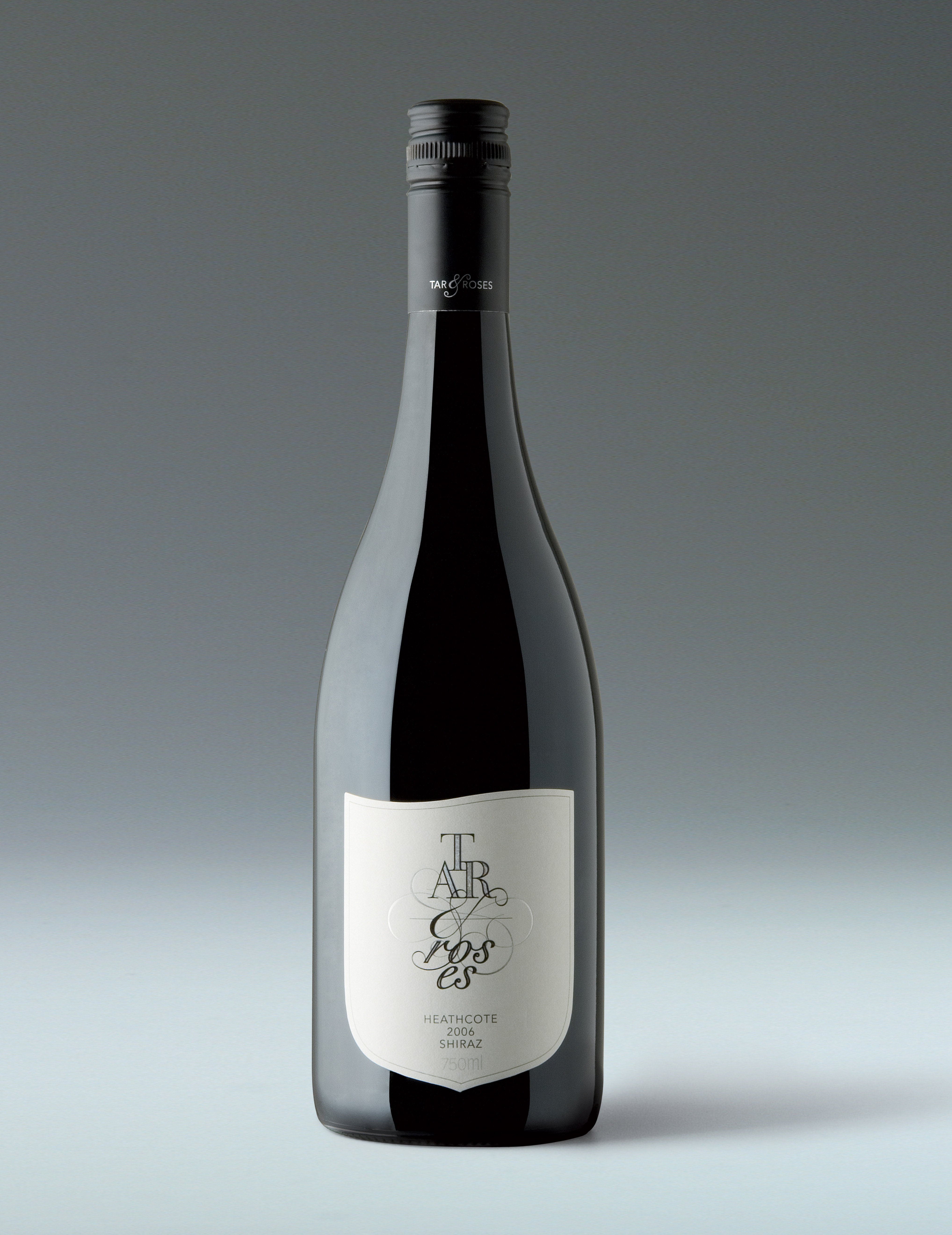
The wine package is, quite deliberately, designed to reflect that contrast. While the design is comfortable, polite and composed, it is, at the same time, slightly at odds with itself, with its unexpected presentation and quirkiness. The front label looks traditional enough that you might expect the back label would say a lot about the winemakers and the wine, yet it does none of that – no tasting notes, no long winded spiel about the winemakers – just the legal requirements, a carefully crafted photograph of Don and Narelle and the most matter of fact of captions. There is a general tradition, symmetry and classicism to the front label, which is opposed by an asymmetrical top to the front label ‘shield’ and the brand name key words which are unexpectedly and unusually broken across two lines for each word (making the viewer consider them with more than usual care and attention). The front label presents a contrast between the formal and masculine expression of the word TAR and the feminine and decorative expression of the word ROSES along with the ampersand and decorative flourishes which connect the two key brand name words. The back label design is also in contrast to the front – it is unexpected, and, aside from the small expression of the Tar & Roses brand mark in silver foil, could, at first impression, almost be a back label from another wine package altogether.
Don and Narelle craft their wines both in Australia and in Spain, and there are varietals from both of those countries in the Tar & Roses range. Each is presented with a different photograph of the winemakers on the back label – in the vineyard or region from which the fruit for that varietal was sourced – whether it be here in Australia or in Spain. So, collectively, the label range is a little documentary of the winemakers travelling lifestyles.
< Less